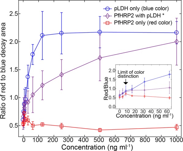
Fig. 5.

Ratios of red to blue decay areas. The simple function of the colour ratios calculated from Fig. 4 provided a criterion to discriminate colours as a function of sample concentrations. The blue curve with circle makers was above the other curves, indicating strong blue colours. For the blue curve, pLDH concentrations were shown in the x-axis. The middle curve with diamond markers was an intermediate curve in between top and bottom curves, and represented the mixture colours of red and blue. For the middle curve, PfHRP2 concentrations were shown in the x-axis, and pLDH/PfHRP2 was mixed at the ratio of 1:6. The bottom curve indicated the strong red colours. For the red curve, PfHRP2 concentrations were shown in the x-axis. The arrows in the inserted graph showed the limit of colour distinction from which the blue colours were distinguishable from the red colours. Error bars are standard deviations from triplicate experiments
