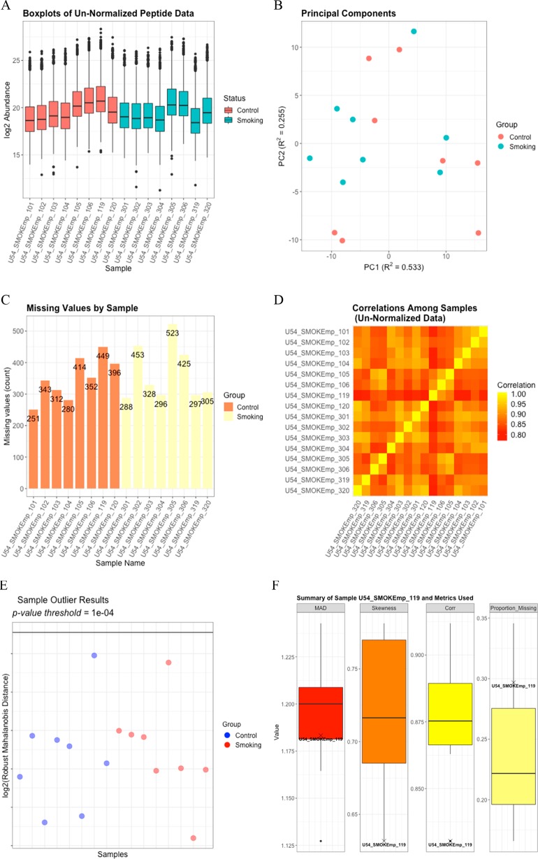
Figure 1.
(A) Boxplots for each log2 sample prior to QC. (B) The PPCA plot of the log2 peptide data without imputation of missing values shows minimal clustering of the treatment groups. (C) A bar graph of the number of missing values per sample does not reveal anything systematically different between the two groups or the individual samples. (D) The Pearson correlation heatmap among the log2-transformed samples shows some variation in correlation across the samples but nothing to indicate a potential outlying sample. (E) The rMd plot does not identify any potential sample outliers. (F) The values for each of the metrics included in the rMd calculation are indicated on boxplots for sample U54_SMOKEmp_119, which is the control sample having the highest log2 rMd score.

