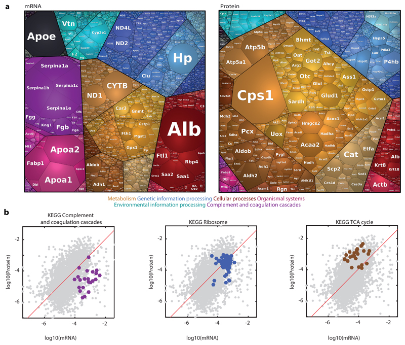
Fig. 4. Correlations between mRNA and protein levels.
a, Proteomaps for visualizing the distributions of the mean mRNA and mean proteins over all FACS gates. Each tile in the map represents a gene, size is proportional to its fraction in the total dataset. Tile colors represent different gene annotations, color-code legend is below the maps. Genes/protein closer on the maps and sharing the same color are closer in function. Visualization was done using https://bionic-vis.biologie.uni-greifswald.de/ 13–15. Color classification key for selected categories is shown at the bottom. b, Gate-averaged mRNA and protein levels are mildly correlated (Spearman’s r=0.5). Shown are three KEGG functional classifications with distinct ratios of mRNAS and proteins. Red is a linear regression line. n = 3,051 genes averaged over 5 mice.

