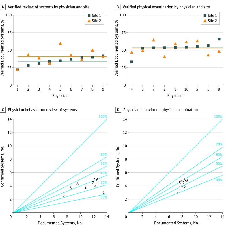
Figure 3. Individual Physician Behavior on Review of System and Physical Examination Documentation.
A-B, Each point represents the percentage of documented systems that were confirmed by observation. Each blue square represents 1 physician’s behavior at site 1, and each orange triangle represents the same physician’s behavior at site 2. Horizontal lines represent the mean performance for each physician at each site. C-D, The number of documented systems is on the x-axis, while the number of confirmed systems is on the y-axis. A perfect performance would lie on the diagonal line labeled 100%. Each physician is represented by a number (1-9), which is consistent across all 4 plots.

