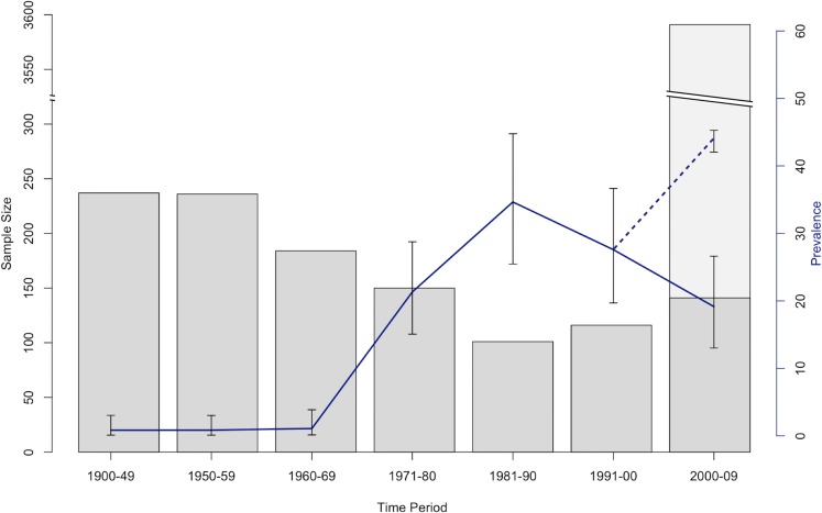
Fig 2. Bd infection prevalence in anurans of the Sierra Nevada from 1900–2009.
Bar graphs denote sample size from each time period. Dark gray bars denote samples from museum specimens, and light gray bars denote samples collected from live animals in the field (live animal data from [7]). Blue line denotes Bd infection prevalence calculated from museum specimens only, and dotted blue line denotes Bd infection prevalence including both museum specimens and live animals in the field (i.e. museum specimens and data from [7]).

