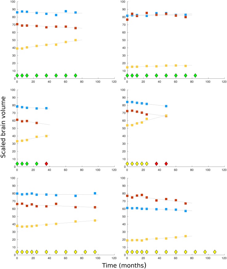
Fig 1. Sample plots by time (months) of scaled brain volumes for 6 participants.
Diagnosis points are shown as diamonds at the base of each graph, with a healthy diagnosis shown in green, MCI in yellow, and Alzheimer’s disease in red. In the top two graphs, the participants have a healthy diagnosis throughout monitoring. In the middle two graphs the participants receive a diagnosis of Alzheimer’s disease 3 years after monitoring began. In the bottom the two graphs, the participants have a diagnosis of mild cognitive impairment throughout monitoring. The scaled brain volumes are shown in each graph from the top down as: whole brain (blue markers), hippocampus (red markers), and ventricles (yellow markers).

