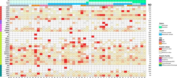
Figure 1.
Targeted multiplex proteomics heatmap. Individual samples are plotted in columns (case IDs are indicated at the bottom of each column). Proteins are plotted in rows. Each cell shows the protein level in amol/μg. For each protein, levels of expression are shown on a colour scale from the lowest (light grey) to the highest (red) value. ND indicates non-detectable levels. Percentage of ND for each protein is shown in the rightmost column. RAS and PIK3CA status (MUT, mutation; WT, wild type), tissue (PRIM, primary sample; MET, metastasis), and site are indicated; NA: not applicable.

