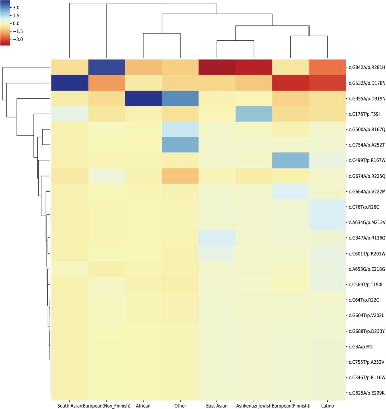
Figure 5.
Cluster heat-map shows the significance of the 23 pathogenic variations enriched or depleted in each population compared with the worldwide average. Each row represents a variation, and each column represents a population. A unit in the cluster heat map is colored based on the log10 of p-value.

