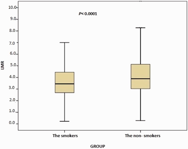
Figure 3.
Comparison of lymphocyte-to-monocyte ratio (LMR) between the smokers and nonsmokers. The box-whisker plots show the LMR for the smokers and non-smokers. The heavy black horizontal lines for each group represent the means, the extremities of the box are the 25th and 75th percentiles, and the error bars are the minimum and maximum outliers.

