
Fig. 1.
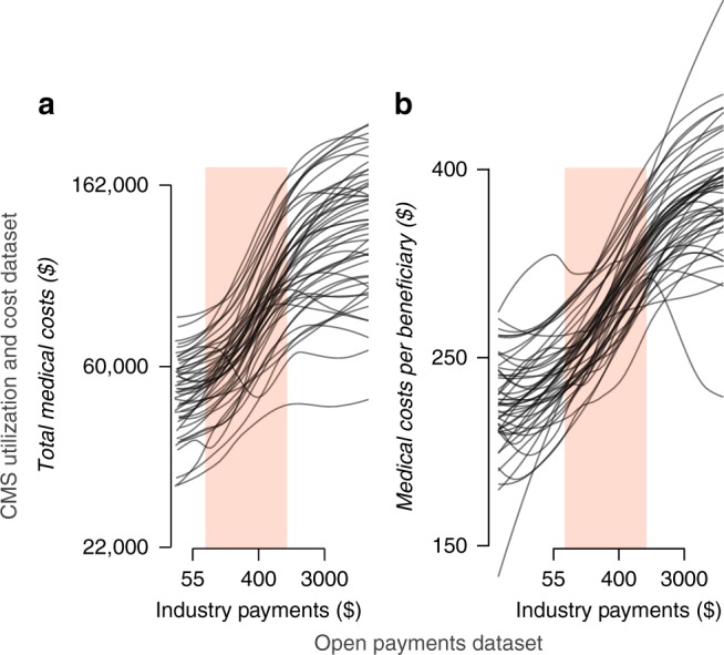
Exploring the relationship between industry payments to providers and medical costs. Each line represents a loess smoother of the scatterplot of the providers within each state (see Methods for details). The shaded bands mark the middle 50% of the distribution of payments. Both axes are displayed on the log scale. The data displayed on the x axis comes from the Open Payments data set (openpaymentsdata.cms.gov); the data displayed on the y axis comes from the CMS Utilization and Cost data set (cms.gov). See also Supplementary Fig. 1. a Total industry payments versus total annual medical (non-drug) costs of each provider. b Total industry payments versus average annual medical costs per beneficiary of each provider