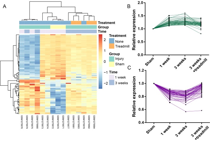
Figure 1.
Heatmap and line graphs for candidate genes. (A) Heatmap for candidate genes: Blue represents genes with decreased expression levels; and orange-red represents genes with increased expression levels. (B) Line graphs of cluster 1, indicating increased expression levels following injury that was reversed following treadmill rehabilitation. (C) Line graph of cluster 2, indicating decreased expression levels following injury that was reversed following treadmill rehabilitation.

