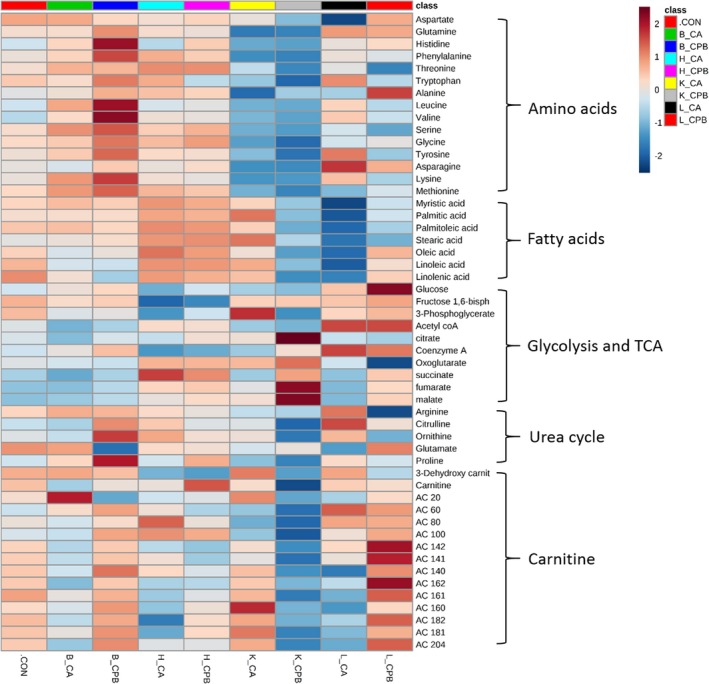
Figure 2.

Heatmap. The heatmap provides intuitive visualization of a data table. Each colored cell on the map corresponds to peak area average value in the data table, with samples in columns and features/compounds in rows. Colors indicate Z score (standard deviation from the mean) with red representing increased and blue representing decreased with respect to control. The heatmap was generated with MetaboAnalyst 4.0 using normalized data (log transformation, Pareto scaling) using Euclidean distance measure. B indicates brain; CA, cardiac arrest; CON, control; CPB, cardiopulmonary bypass; H, heart; K, kidney; L, liver.
