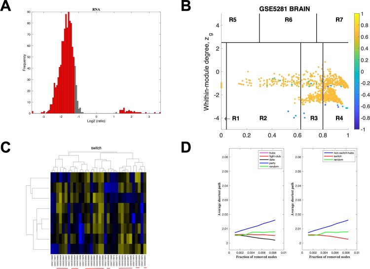
Fig 7. SWIM analysis of the superior frontal gyrus.
A. Distribution of the fold-change values for GSE5281 brain microarray gene expression data from the SFG. The x-axis represents the fold-change value (log2 of the fold-change) that is the ratio of the average expression data in AD patients compared to the average expression data in normal controls computed for protein-coding and non-coding RNAs. The y-axis represents the frequency of the obtained fold-change values. The grey bars represent the fold-change values associated with protein-coding and non-coding RNAs that will be discarded according to the selected threshold. The red bars represent the fold-change values associated with protein-coding and non-coding RNAs that were retained for further analysis. B. Heat cartography map for GSE5281 brain data from the SFG. correlation network. The plane is identified by two parameters: Zg (within-module degree) and Kπ (clusterphobic coefficient) and it is divided into seven regions each defining a specific node role (R1-R7). High Zg values correspond to nodes that are hubs within their module (local hubs), whereas low Zg values correspond to nodes with few connections within their module (non-hubs within their communities, but they could be hubs in the network). Each node is colored according to its average Pearson Correlation coefficient (APCC) value. Yellow nodes are party and date hubs, which are positively correlated in expression with their interaction partners. Blue nodes are the fight-club hubs, which have an average negative correlation in expression with their interaction partners. Blue nodes falling in the region R4 are the switch genes, which are characterized by low Zg and by high Kπ values and are connected mainly outside their module. C. Dendrogram and heat map for switch genes in GSE5281 brain microarray gene expression data from the SFG. The expression profiles of switch genes (including protein-coding and non-coding RNAs) are clustered according to rows (switch genes) and columns (samples) of the switch genes expression data (biclustering). The colors represent different expression levels that increase from blue to yellow. The red line under the x axis labels denotes AD samples. D. Robustness for the GSE5281 brain correlation network from the SFG. The x-axis represents the cumulative fraction of removed nodes, while the y-axis represents the average shortest path. The shortest path between two nodes is the minimum number of consecutive edges connecting them. Each curve corresponds to the variation of the average shortest path of the correlation network as function of the removal of nodes specified by the colors of each curve.

