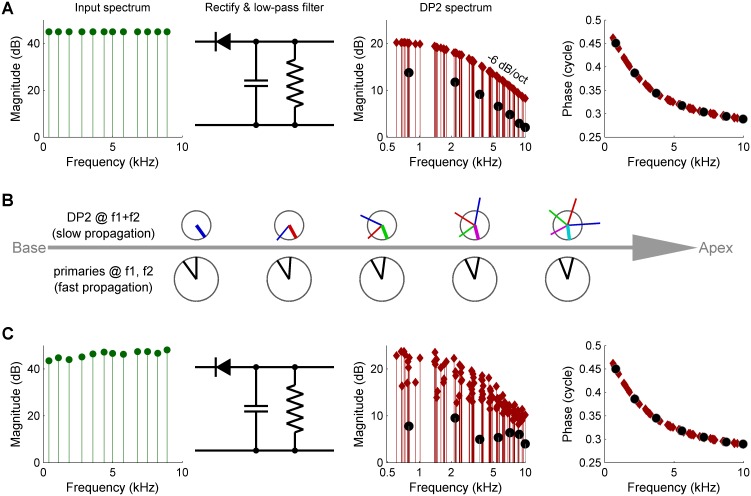
Figure 2. Three causes of magnitude scatter in DP2 spectra.
(A) Combinatorial effect illustrated by feeding an equal-amplitude zwuis tone complex to a nonlinear circuit comprising a rectifier and low-pass filter (corner frequency 2.5 kHz). The 2nd harmonics (solid circles) are 6 dB weaker than the remaining DP2s (red diamonds). (B) Vector addition of DP contributions along the traveling wave (left to right). Lower row of ‘clocks’ depict amplitude and phase of the primaries f1,f2 <<CF. They accumulate little phase and their amplitude hardly grows upon traveling. Upper clocks depict a near-CF DP2 at f1+f2. Colors indicate the origin of each local contribution. Near-CF DP2 components suffer considerable phase accumulation and amplitude variation while traveling. The eventual amplitude (rightmost location) is the vector sum of multiple contributions widely differing in phase and amplitude. This interference obfuscates the spectral properties of DP2 generation investigated here. (C) Unequal primary amplitudes entering the nonlinear circuit generate a predictable scatter in DP2 magnitudes (see text). Companion phases are not affected by lack of equalization of the input. The 0.5-cycle low-frequency limit of the phase reflects the ‘negative polarity’ of the rectification.


