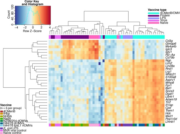
Figure 6.
Top 30 most variable genes across all samples. Pairwise Euclidian distances between all samples were calculated from the normalised counts of genes with the maximum dispersion from the population mean and are represented by the column and row dendrograms. Heatmap tiles correspond to row z scores, centred and scaled upon the mean expression value for that gene across the dataset, with orange and blue tiles indicating increased or decreased expression relative to the population mean, respectively.

