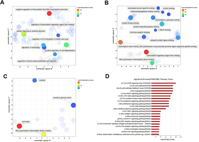
Figure 5.
Gene Ontology (GO) and pathway enrichment analysis. (A–C) GO enrichment analysis was summarized and visualized as a scatter plot using REVIGO28. Scatter plot was generated in REVIGO by clustering the significant (adjusted p-value < 0.05) GO terms remaining after redundancy reduction for the biological processes (A), molecular functions (B) and cellular components (C) in a two-dimensional space (2D space), according to semantic similarities. The bubble color indicates -log10 (adjusted p-value) according to the legend. Bubble size refers to the frequency of the GO term in the underlying Homo sapiens database. Cluster representatives with the lowest dispensability value are labelled. (D) The bar plot shows −log10 (adjusted p-value) of the significantly enriched PANTHER pathways (adjusted p-value < 0.001) for all nodes of the microRNA-based network. Fold enrichment for each pathway is shown in parentheses as the percentage.

