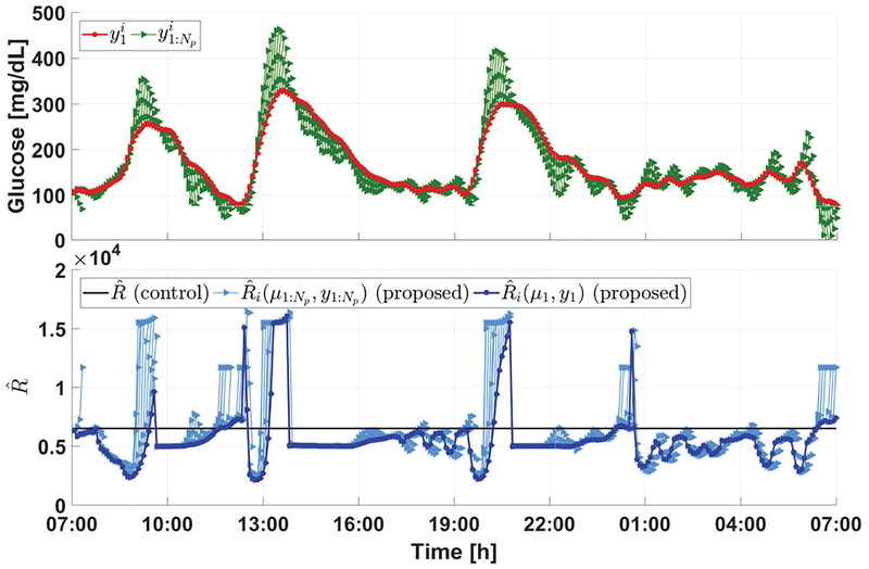
Fig. 7:
Illustration of control penalty adaptation. In the upper panel, the red curve shows the trend of first element in the glucose prediction sequence with respect to discrete time i, while the green curves denote the sequences of . Note that the red and green curves denotes glucose predictions, which are different from actual CGM measurements. In the lower panel, the dark blue curve shows the trend of with respect to discrete time i, the light blue curves denote the sequences of , and the black line indicates the constant adopted in [7]. The superscript i used here indicates the dependence of a variable on time.

