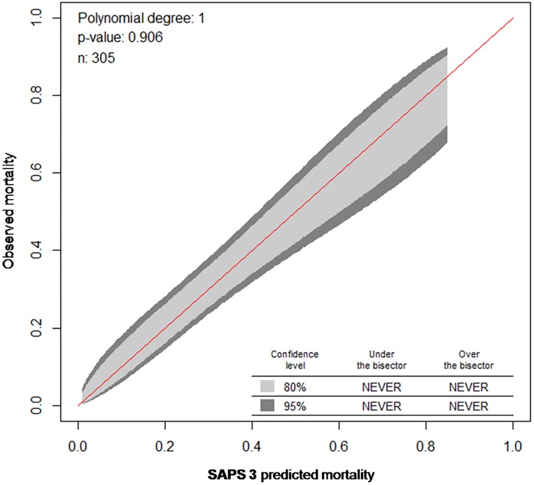
Fig 2. Calibration belt for the SAPS 3 model comparing observed and predicted ImCU mortality.
Calibration curves with 80% (inner belt, light grey) and 95% confidence intervals (outer belt, dark grey) were created by plotting the predicted mortality (x-axis) against observed mortality (y-axis), thus if the curve is above the bisector (red line), it corresponds to an underestimation. Overall, the SAPS 3 calibrates well (P = 0.906).

