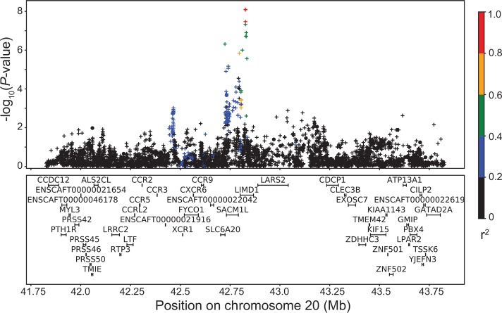
Fig 6. LD plot for significant CCLD association.
Linkage disequilibrium plot of the region around the imputed CFA20 association with CCLD. Array genotypes are shown as o, imputed data are shown as +. Colors indicate amount of LD with the most significantly associated SNP, ranging from black (r2<0.2) to red (r2>0.8).

