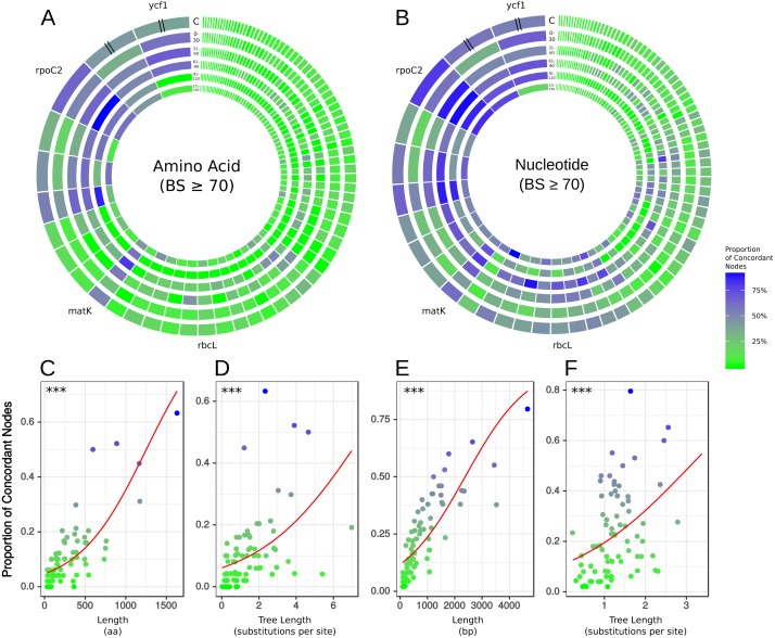
Figure 2. Gene tree concordance/conflict at varying time scales.
Each diagram represents a different molecule type and shows the proportion of concordance each gene exhibits at the five time slices shown in Fig. 1: (1) 150–121 mya, (2) 120–91 mya, (3) 90–61 mya, (4) 60–31 mya, (5) 30–0 mya and C is the concordance summed over all the time scales. The individual genes are scaled by length of alignment; however, ycf1 and ycf2 are cut to approximately the length of rpoC2 due to their extremely long alignments. (A) Results from amino acid data considering only nodes with bootstrap support ≥70%. (B) Results from nucleotide data considering only nodes with bootstrap support ≥70%. The plots along the bottom show relationships between gene concordance levels and alignment length and tree length, excluding outlying genes (see Methods). Each point represents the proportion of concordance considering only nodes with bootstrap support ≥70%. Red lines show the predicted values from logistic regression and asterisks give the p-value of the relationship from univariate logistic regression, ∗∗∗ = p < 0.001. (C) Logistic regression of concordant nodes from amino acid data against alignment length. (D) Logistic regression of concordant nodes from amino acid data against tree length. (E) Logistic regression of concordant nodes from nucleotide data against alignment length. (F) Logistic regression of concordant nodes from nucleotide data against tree length.

