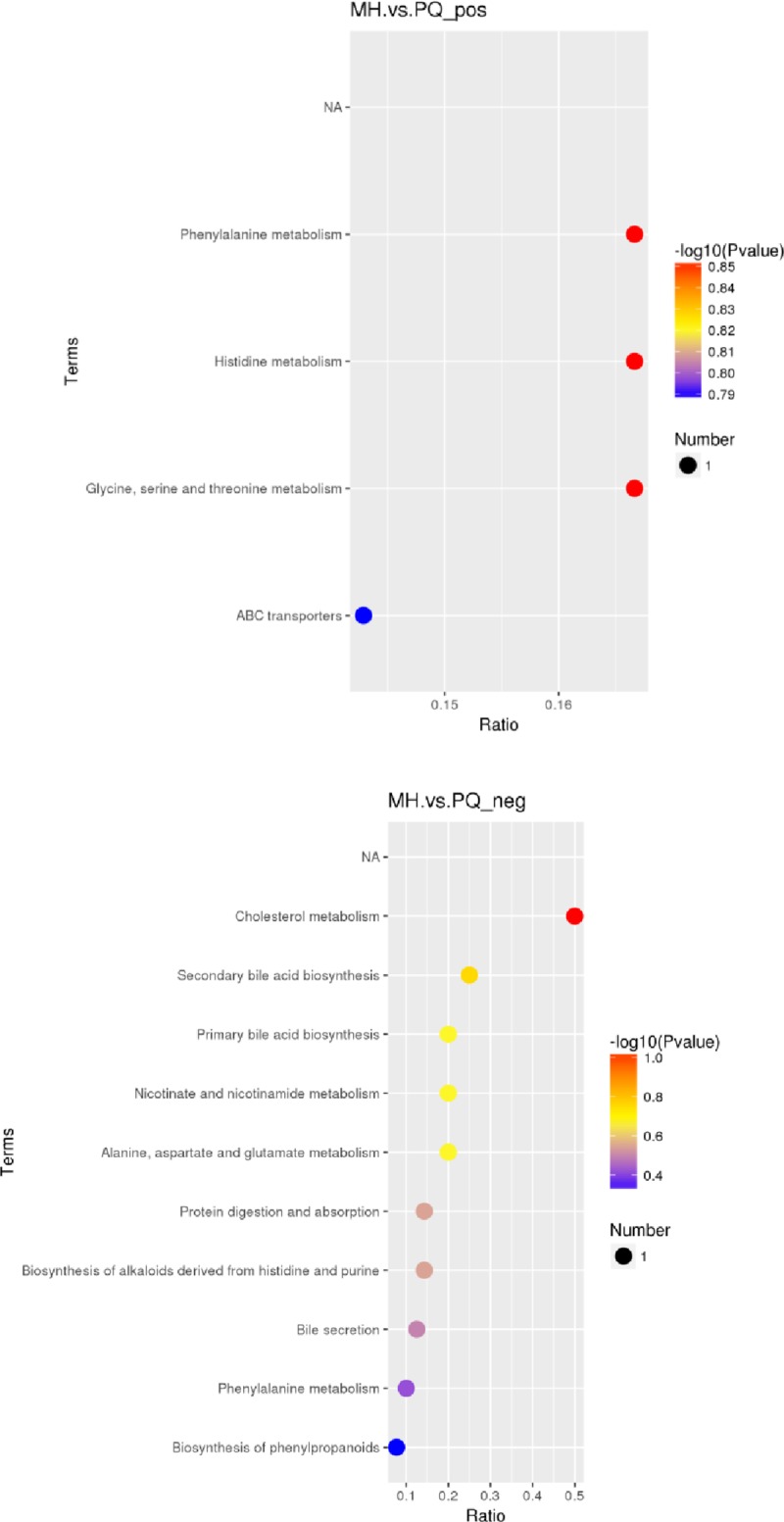
Fig 8. KEGG enrichment bubble chart (the upper figure represents the KEGG enrichment results under the MS positive ion mode, and the below figure represents the KEGG enrichment results under the MS negative ion mode.

The abscissa in the figure is the ratio of the number of different metabolites in the corresponding pathway to the number of identified total metabolites. The higher the ratio, the higher the concentration of differential metabolites in the pathway. The color of the dot represents the p-value of the hypergeometric test. The smaller the p-value, the greater the reliability and the more statistically significant of the test. The size of the dot represents the quantity of differential metabolites in the corresponding pathway. A larger point size indicates more different metabolites in the pathway).
