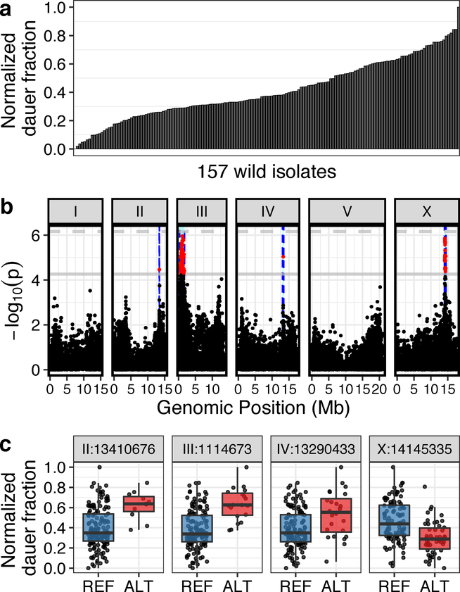
Fig. 2: Genome-wide association (GWA) mapping reveals four major loci underlying natural variation in dauer-pheromone response.
(a) A bar plot for the natural variation of ascr#5-induced dauer formation at 25°C across 157 C. elegans wild isolates (one-way analysis of variance (ANOVA), log10p = −49.6598) is shown. Each bar represents the phenotypic response of a single wild isolate to 800 nM ascr#5. (b) A manhattan plot for single-marker based GWA mapping of the ascr#5-induced dauer formation trait from (a) is shown. Each dot represents a single-nucleotide variant (SNV) that is present in at least 5% of the 157 wild strains. The genomic position in Mb, separated by chromosome, is plotted on the x-axis, and the statistical significance of the correlation between genotype and phenotype is plotted on the y-axis. Two significance thresholds are shown. The horizontal dashed line denotes the Bonferroni-corrected p-value threshold using all markers, and the gray horizontal line denotes the Bonferroni-corrected p-value threshold using independent markers correcting for linkage disequilibrium (genome-wide eigen-decomposition significance threshold). SNVs are colored red if they pass the second threshold. The region of interest for each QTL is represented by vertical blue dotted lines. (c) Tukey box plots of phenotypes split by peak marker position of the four QTL (chrII:13410676, chrIII:1114673, chrIV:13290433, chrX:14145335) are shown. Each dot corresponds to the phenotype of an individual strain, which is plotted on the y-axis as the normalized dauer fraction phenotype. Strains are grouped by their genotype at each peak QTL position, where REF (blue) corresponds to the reference allele from the laboratory N2 strain and ALT (red) corresponds to the alternative allele. The horizontal line in the middle of the box is the median, and the box denotes the 25th to 75th quantiles of the data. The vertical line represents the 1.5 interquartile range.

