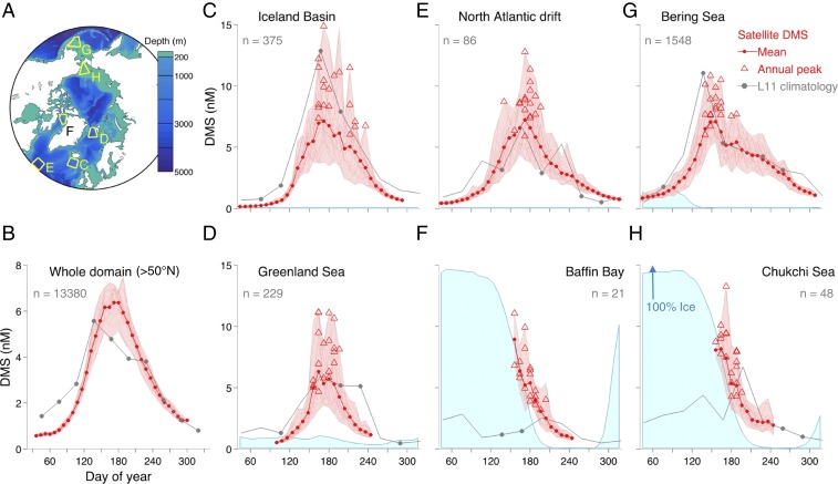
Fig. 1.
DMS seasonal cycles in Subarctic and Arctic seas. (A) Bathymetric map and ecoregions (yellow polygons) used to illustrate DMS dynamics; (B–H) mean DMS seasonal cycle derived from the satellite algorithm (red line and dots) and from the L11 climatology (gray line and dots) for latitudes higher than 50°N (B) and 6 smaller ecoregions (C–H) shown in A. In the satellite seasonal cycles (C–H), light-red lines mark individual years, light-red shadow marks the 19-y envelope, and red triangles mark the annual peak for each year. In the monthly L11 climatology, markers indicate that in situ data were available in a given month, whereas no marker indicates that monthly DMS was estimated through interpolation. The numbers in gray indicate the amount (n) of in situ measurements available to calculate the L11 climatology in a given ecoregion (1979–2010). The light-blue shade is the mean fractional ice cover, scaled to the maximum of the y axis, shown only for regions within the seasonal ice zone. Analogous plots for FDMS are shown in SI Appendix, Fig. S6.

