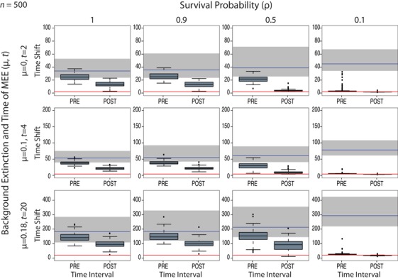
Figure 4.

Estimates of the pre‐MEE and post‐MEE rate shift times bounding the second time interval, for Model C and under varying levels of μ and mass extinction survival probability, ρ. The red line indicates the value of the true (simulated) time of the MEE, t. The time is shown from present to past: left boxplot (post‐MEE) corresponds to the rate shift between time intervals “MEE” and “post‐MEE,” after which diversity is expected to recover; right boxplot (pre‐MEE) corresponds to the rate shift between time intervals “pre‐MEE” and “MEE,” after which the MEE is expected to have occurred. The grey bar indicates the variance in root ages across tree simulations, while the blue line shows the mean of this range. Notice the low variance and the small difference between the two boxplots (pre‐ and post‐MEE rate shifts), indicating that the time‐slice model is able to locate the MEE even when modeled as a nearly single‐pulse (instantaneous) event. See Figure S6 for the results with varying values of N (100, 200, and 500). Figures S7 and S8 show the equivalent results of this analysis for Model A.
