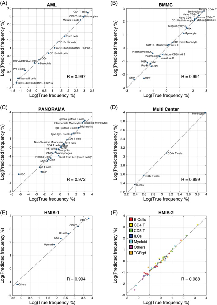
Figure 3.

Scatter plots between true and predicted population frequencies. (A) AML, (B) BMMC, (C) PANORAMA, (D) Multi‐Center, (E) HMIS‐1, and (F) HMIS‐2. In each plot, the dashed line shows the leastsquares fit error line, and the R value represents Pearson correlation coefficient between true and predicted frequencies. [Color figure can be viewed at wileyonlinelibrary.com]
