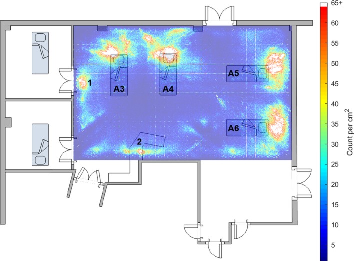
Figure 1.

A heat map of the frequency with which one of the five loudest noises above 35 dB originated from each 1 cm2 of the intensive care unit bay for the 249‐day study period, superimposed on a floor plan of the bay. The position and identifier for each of the four beds in the bay is shown, as well as the work bench position. The area of noise marked ‘1’ is outside the side room that was preferentially used, and shows where conversations between staff about the patient in the side room commonly took place. The areas of noise marked ‘2’ correspond to the positions of the telephones. This can be interpreted as a map of the ‘noisiness’ of areas of the bay. The grid lines are an artefact of the computational methods.
