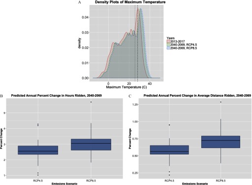
Figure 5.
Projected annual changes in Citi Bike® ridership due to climate change. (A) Density plots of observed maximum temperature from 2013 to 2017 (red, solid line), multi-model mean projected maximum temperature from 2040 to 2069 under RCP4.5 (green, dashed line) and RCP8.5 (blue, dotted line). The black vertical dashed and dotted lines represent the threshold maximum temperature value estimated from the segmented regression for total hours ridden (28.1°C) and average distance ridden (25.8°C), respectively. (B) Average annual percentage change in the predicted total hours ridden from 2013 to 2017 to 2070 under the RCP4.5 and RCP8.5 emissions scenarios. The box plots show the distribution of estimates from the 21 climate models for both emissions scenarios RCP4.5 and RCP8.5. (C) is as for (B), but for average distance ridden. Boxes extend from the 25th to the 75th percentile, horizontal bars represent the median, the upper whisker extends to the highest value no larger than the 75th percentile plus (interquartile range), the lower whisker extends to the lowest value no lower than the 25th percentile minus , and the dots represent outliers.

