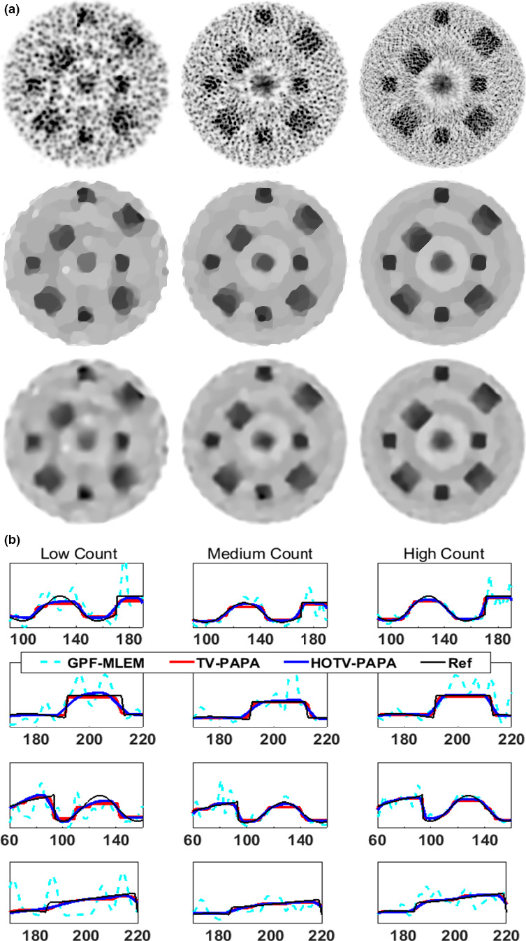
Figure 3.

Images (top) and profiles (bottom) from the simulated Sinc+ phantom for (left to right) low, medium, and high count data are shown. The columns from left to right represent the low, medium and high count data of the Sinc+ phantom. The top three image rows are optimal Gaussian postfiltered (GPF‐)MLEM, TV(1)‐PAPA, and HOTV‐PAPA reconstructions. Each column of plots on the remaining rows represents segments of the four profiles shown in dashed lines in Fig. 1(b). [Color figure can be viewed at wileyonlinelibrary.com]
