. 2019 Sep 19;8:e47713. doi: 10.7554/eLife.47713

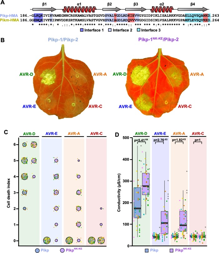
Figure 1. Structure-informed engineering expands Pikp-mediated effector recognition in N. benthamiana.

(A) Sequence alignment of the Pikp-1 and Pikm-1 HMA domains. Secondary structure features of the HMA fold are shown above, and the residues that are located at binding interfaces are as colored. Key residues from interface 2 and interface 3 involved in this study are highlighted in red. (B) Representative leaf images showing Pikp- (left) or Pikp-1NK-KE (right)-mediated cell death in response to AVR-Pik variants as autofluorescence under UV light. (C) Autofluorescence intensity is scored as previously described (Maqbool et al., 2015; De la Concepcion et al., 2018). Cell death assay scores are represented as dot plots for Pikp and PikpNK-KE (blue and purple, respectively). For each sample, all of the data points are represented as dots with a distinct color for each of the three biological replicates; these dots are plotted around the cell death score for visualization purposes. The size of the centre dot at each cell death value is directly proportional to the number of replicates in the sample with that score. The total number of repeats was 80. Data for Pikp have been previously shown (De la Concepcion et al., 2018), but was acquired at the same time as those for PikpNK-KE. The estimation methods used to visualize differences in the data sets are shown in Figure 1—figure supplement 3. (D) Conductivity measurements showing ion leakage as a quantitative measure of cell death. The centre line represents the median, the box limits are the upper and lower quartiles, the whiskers extend to the largest value within Q1 – 1.5x the interquartile range (IQR) and the smallest value within Q3 + 1.5x IQR. All the data points are shown as dots with distinct colors for each biological replicate. For each experiment, six biological replicates with 5 or 10 internal repeats were performed (total data points = 40). ‘p’ is the p-value obtained from statistical analysis and Tukey’s HSD (honestly significant difference) test.

Figure 1—source data 1. Cell death scoring data used in the preparation of Figure 1C.
DOI: 10.7554/eLife.47713.009
Figure 1—source data 2. Conductivity measurements used in the preparation of Figure 1D and Figure 1—figure supplement 2B.
DOI: 10.7554/eLife.47713.010

Figure 1.

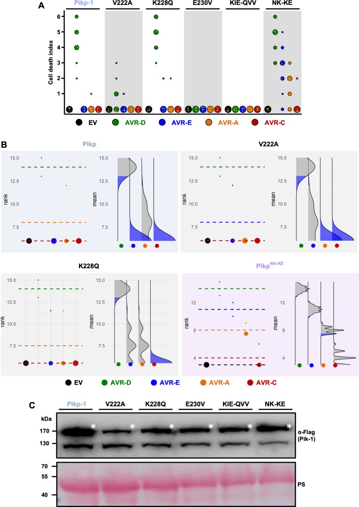
Figure 1—figure supplement 1. Mutations at interface 2 of the Pikp-1 HMA domain compromise the response to AVR-Pik effectors.

Figure 1—figure supplement 1.

(A) Cell-death assay scoring represented as dot plots for Pikp-1 mutants with mutations on HMA interface 2 and 3. For each sample, all of the data points are represented as dots with a distinct color for each of the three biological replicates; these dots are plotted around the cell death score for visualization purposes. The size of the central dot at each cell death value is proportional to the number of replicates of the sample with that score. The number of repeats was 18 for each mutant. (B) Statistical analysis by estimation methods of the cell death assay for Pikp-1 mutants. The left panel represents the ranked data (dots) for each effector, and their corresponding mean (dotted line). The size of the dots is proportional to the number of observations with that value. The right panel shows the distribution of 1000 bootstrap sample rank means for each effector. The blue areas represent the 0.025 and 0.975 percentiles of the distribution. A sample (effector) score is considered significantly different from the control (EV) when the control rank mean (dotted line on the left) falls beyond the blue regions of the effector mean distribution. When the rank means for different effectors have the same value, only one dotted line is visible (EV, AVR-E and AVR-C for Pikp and K228Q, and EV, AVR-A and AVR-C for V222A). (C) Western blot analysis confirming similar levels of Pik-1 protein accumulation in N. benthamiana. The asterisks mark the Pik-1 band, PS = Ponceau Stain.
Figure 1—figure supplement 1—source data 1. Cell death scoring data used in the preparation of Figure 1—figure supplement 1A.
DOI: 10.7554/eLife.47713.004
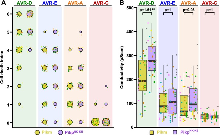
Figure 1—figure supplement 2. Response of PikpNK-KE to AVR-Pik effectors compared to that of Pikm.

Figure 1—figure supplement 2.

(A) Cell-death autofluorescence scoring represented as dot plots for Pikm and PikpNK-KE (yellow and purple, respectively). The numbers of repeats were 80 and 90 for PikpNK-KE and Pikm, respectively. For each sample, all of the data points are represented as dots with a distinct color for each of the three biological replicates; these dots are plotted around the cell-death score for visualization purposes. The size of the central dot at each cell death value is proportional to the number of replicates of the sample with that score. Data for Pikm have been previously shown (De la Concepcion et al., 2018), but were acquired at the same time as those for PikpNK-KE. The estimation methods used to visualize differences in the data sets are shown in Figure 1—figure supplement 4. (B) Conductivity measurements showing ion leakage as a quantitative measure of cell death. The centre line represents the median, the box limits are the upper and lower quartiles, the whiskers extend to the largest value within Q1 – 1.5x the interquartile range (IQR) and the smallest value within Q3 + 1.5x IQR. All of the data points are shown as dots with distinct colors for each biological replicate. For each experiment, six biological replicates with 5 or 10 internal repeats were performed (total data points = 40). ‘p’ is the p-value obtained from statistical analysis and Tukey’s HSD.
Figure 1—figure supplement 2—source data 1. Cell-death scoring data used in the preparation of Figure 1—figure supplement 2A.
DOI: 10.7554/eLife.47713.006
Figure 1—figure supplement 3. Estimation graphics for cell death, Pikp vs PikpNK-KE.

Figure 1—figure supplement 3.

Statistical analysis by estimation methods of the cell-death assay for Pikp and PikpNK-KE. For each effector, the panel on the left represents the ranked data (dots) for each NLR, and their corresponding mean (dotted line). The size of the dots is proportional to the number of observations with that specific value. The panel on the right shows the distribution of 1000 bootstrap sample rank means for PikpNK-KE. The blue areas represent the 0.025 and 0.975 percentiles of the distribution. The response of Pikp and PikpNK-KE are considered significantly different if the Pikp rank mean (dotted line, left panel) falls beyond the blue regions of the PikpNK-KE mean distribution.
Figure 1—figure supplement 4. Estimation graphics for cell death, Pikm vs PikpNK-KE.

Figure 1—figure supplement 4.

Statistical analysis by estimation methods of the cell-death assay for Pikm and PikpNK-KE. For each effector, the panel on the left represents the ranked data (dots) for each NLR, and their corresponding mean (dotted line). The size of the dots is proportional to the number of observations with that specific value. The panel on the right shows the distribution of 1000 bootstrap sample rank means for PikpNK-KE. The blue areas represent the 0.025 and 0.975 percentiles of the distribution. The responses of Pikm and PikpNK-KE are considered significantly different if the Pikp rank mean (dotted line, left panel) falls beyond the blue regions of the PikpNK-KE mean distribution.