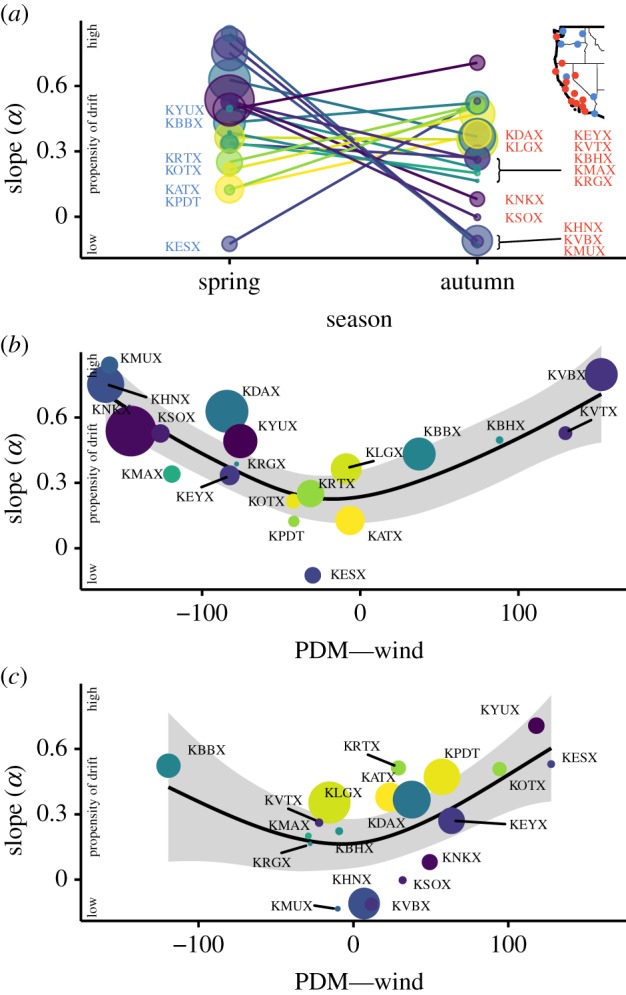
Figure 2.

(a) Seasonal propensity of drift (i.e. slope of α). Radar site labels shaded in blue show increasing slope of α values (i.e. more drift) from spring to aututmn. Those in red show decreasing values (i.e. less drift). Inset shows the locations of decreasing (red) and increasing (blue) drift. (b) Spring and (c) autumn mean difference in PDM and wind direction against the propensity of drift (i.e. slope of α). Grey error bars represent 95% confidence intervals from generalized additive model. All points are shaded by WSR station latitude and the size is scaled to the cube root of migration intensity. (Online version in colour.)
