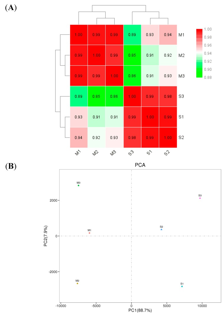
Figure 2.
(A) Heat map of gene expression levels in the six samples. The darker the color is, the greater the correlation is. Three samples (M1, M2 and M3) are in the Sus-Lab strain, and other three samples (S1, S2 and S3) are in the SF-Sel strain. The same means as followed. (B) Principal component analysis (PCA) of six samples.

