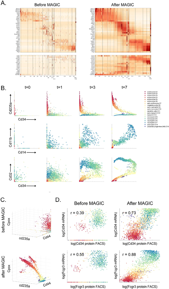
Fig 2: MAGIC applied to mouse myeloid progenitor data:
Mouse bone marrow dataset (Paul et al., 2015). A) Gene expression matrix for hematopoietic genes (top) and characteristic surface markers of immune subsets (bottom) before and after MAGIC. See also Figure S2A. B) Scatter plots of several gene-gene relationships after different amounts of diffusion. In these scatter plots, each dot represents a single cell, plotted according to its expression values (measured at t=0 and imputed for t=1,3,7), and colored based on the clusters identified in (Paul et al., 2015). C) Shows before and after MAGIC of a 3D relationships (with diffusion time t=7). D) FACS measurements of CD34 and FCGR3 protein levels versus transcript levels, before and after MAGIC. Both FACS measurements and mRNA levels are log-scaled as per FACS conventions.

