
Figure 5.
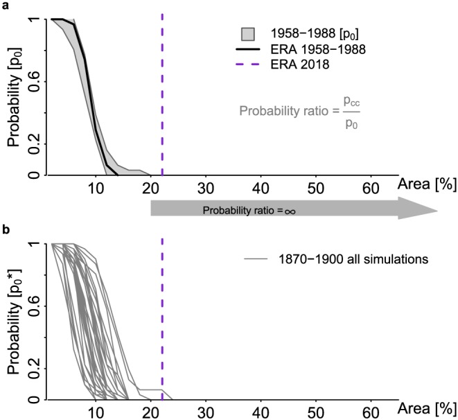
The 2018 north hemispheric concurrent heat extremes in an attribution framework. Shown are average north hemispheric concurrent hot day area thresholds (May to July) relative to the full NH AgPop area (0% to 65%) versus probabilities of exceeding that concurrent hot day area. The GCWH18 area is highlighted by a purple vertical dashed line in each subpanel. (a) Probabilities for exceeding concurrent hot day areas in the reference period 1958–1988 (p 0) for the multimodel ensemble (gray range) and observations (black line). The gray arrow indicates concurrent hot day area thresholds where p 0=0, and thus, the probability ratio is infinity independent of p CC. (b) Probabilities for exceeding concurrent hot day areas in the preindustrial period 1870–1900 ( ). Each gray line represents one model simulation (n=29). (c) Multimodel range of probabilities for exceeding concurrent hot day areas for global warming of +1 °C (orange), +1.5 °C (red), and +2 °C (dark red) with respect to 1870–1900. The boxplots indicate the distributions of the exceedance probabilities of the multimodel ensemble for the 2018‐like concurrent hot day area (22%) for the different warming levels.