Figure 4.

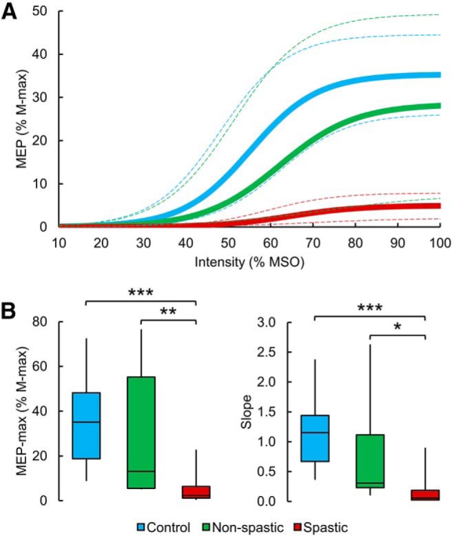
MEP recruitment curves. A, The mean MEP recruitment curves in controls (blue line), non-spastic (green line), and spastic (red line) SCI groups. The x axis indicates the intensity of TMS, and the y axis indicates the MEP size in the quadriceps femoris muscle normalized to the M-max. The 95% CIs of each parameter of the sigmoid function were used to draw the confidence bands (dashed line) around each respective recruitment curve. The spastic group showed a reduced MEP-max and slope compared with the non-spastic group and control subjects. B, Box plot charts represent the group data. The abscissa indicates the groups tested (blue bar represents controls; green bar represents non-spastic SCI; red bar represents spastic SCI), and the ordinate indicates the MEP-max (as a percentage of the M-max, left) and the slope (right). Top and bottom line of the box corresponds to the 95% CI, and the line in the box corresponds to the median. The two bars extend from the maximum and minimum value. *p < 0.05, **p < 0.01, ***p < 0.001.
