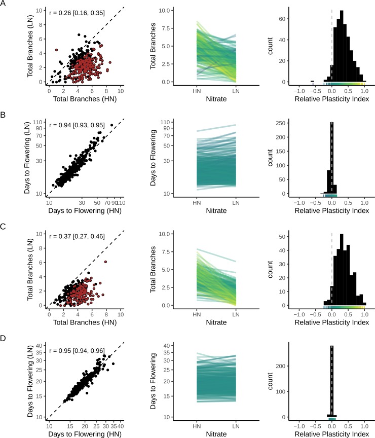
Fig 2. Relationship of trait means between the two nitrate treatments.
Relationship between the mean trait value of each genotype grown on high (HN) or low (LN) nitrate supply shown as a scatter plot (left), as a reaction norm plot (middle) and as a histogram of relative plasticity (right). The latter shows the “relative distance plasticity index” of [105], which varies between -1 and 1 and with zero indicating no plasticity. Genotypes plotted in red on the left panel show significant plastic responses to N, as assessed by a Wilcoxon rank-sum test (false discovery rate < 5%). There were none for flowering time. The reaction norm plots are coloured by the relative plasticity index of each genotype, with the corresponding colour scale shown along the x-axis of the respective histograms. (A, B) Data from 374 MAGIC lines. (C, D) Data from 297 natural accessions. All plants were scored at the 2-silique stage, with means from n = 4–8 replicates per line in each nitrate treatment (median n = 8). Pearson’s correlation coefficient (r) is shown in each panel with the 95% confidence interval shown in brackets. The dashed line on the left panels is the identity line (x = y). Note the log-scale on the flowering time plots.

