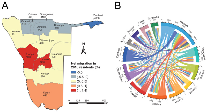
Fig. 1.
Census-derived internal migration in Namibia, September 2010 – August 2011. (A) Net migration by region. The number of net migrants by region is presented under the name of each region. (B) Circular plot of migrant flows between regions. The origins and destinations of migrants are each assigned a colour and represented by the circle’s segments. The direction of the flow is encoded by both the origin region’s colour and a gap between the flow and the destination region’s segment. The volume of movement is indicated by the width of the flow at the beginning and end points. Tick marks on the circle segments show the number of migrants (inflows and outflows).

