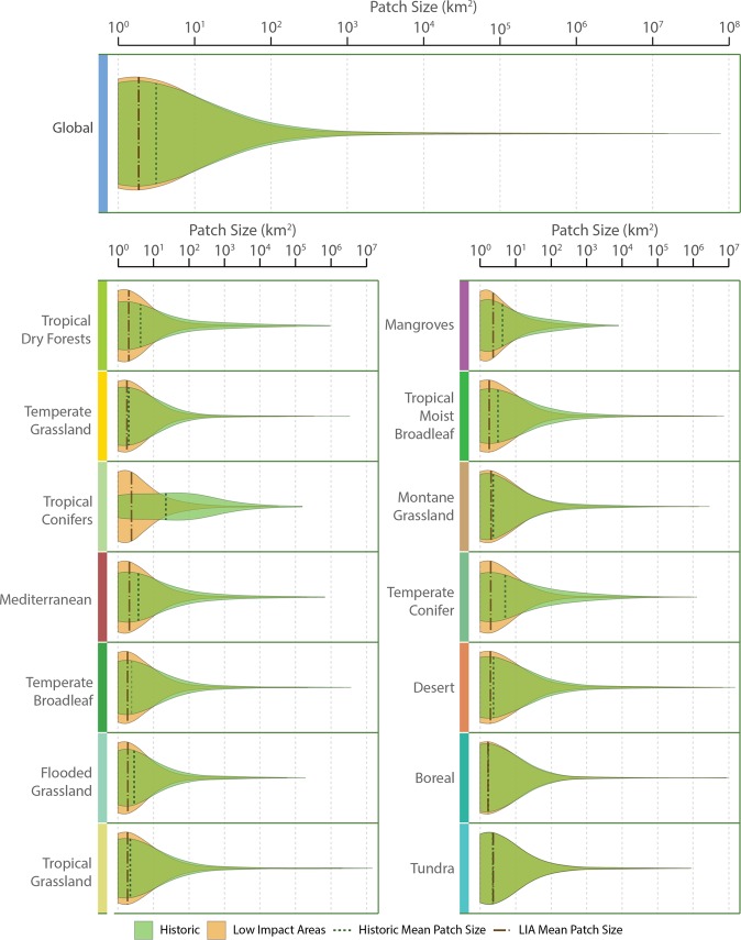
Figure 3.
Patch size distributions across biomes in the baseline and current Low Impact Areas. Violin plots show the probability density of the data at different values. The wider the plot, the more common the patch size. These highlight the change in the proportion of patch sizes between baseline and current Low Impact Areas, such as the loss of medium-sized patches and gain in frequency of the smallest patches in Low Impact Areas. Biomes are ordered top-to-bottom, left-to-right in order of increasing percent Low Impact Area. Figure designed by TerraCommunications.

