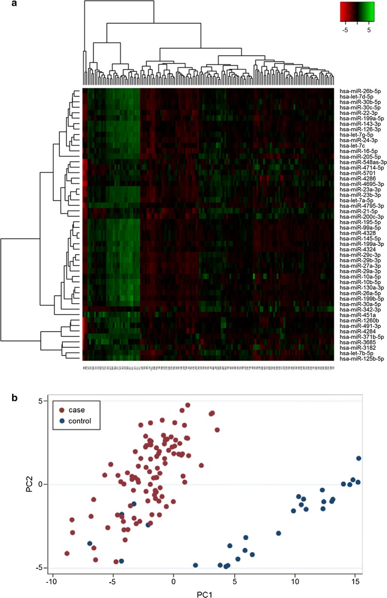
Fig. 2.
Heat map and principal component analysis of miRNAs with greatest variability between cases and controls. a Heat map diagram with unsupervised hierarchical clustering is presented for all samples and the top 50 miRNAs with the largest variation across all samples. Each row represents a miRNA and each column represents a sample. The color scale illustrates the relative expression level of a miRNA across all samples: red color represents an expression level below the mean, green color expression above the mean. b Plot of the principal component analysis performed on all samples and on the 50 miRNAs with the largest variation across all samples. The normalized log-transformed Hy3 values have been used for the analysis

