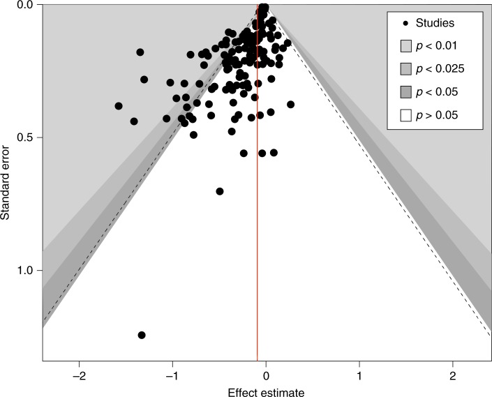
Fig. 2.
Funnel plot displaying the relationship between estimate quality and effect size. Each dot represents a study (e.g. measuring the effect of a certain behavioural intervention); the y-axis represents study precision (standard error) and the x-axis shows the study’s result (effect estimate). This scatterplot is used for the visual detection of systematic heterogeneity between studies. It assumes that studies with high precision will be plotted near the average (red line), and studies with low precision will be spread evenly on both sides of the average, creating a roughly funnel-shaped distribution. Deviation from this shape suggest small-study bias, which is the case here, with lower precision studies reporting stronger effects

