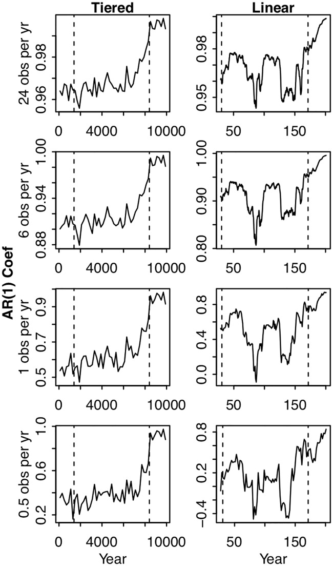
Fig 3. Autocorrelation calculated at different time scales for the two simulated scenarios of tiered increases in P input (left column) and continuous linear increases in P input (right column).
For the tiered increases, autocorrelation was calculated within a given tier, never across tiers. For the continuous linear increases, autocorrelation was calculated in a backwards-looking rolling window. Each row of panels corresponds to a different level of pre-analysis aggregation: in the top row no aggregation was performed, in the second row groups of 4 observations were averaged, in the third row the 24 annual observations were averaged, and for the fourth row 2 ‘years’ of observations were averaged. Vertical dashed lines correspond to the critical points described in Figs 1 and 2.

