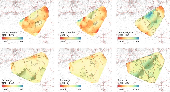
Fig. 3.
MAPI graphs based on the three inter-individual genetic distances (BCD, aR and LKC; see the text for further details). Polygons with dashed contours and with embedded hatching respectively correspond to areas with significantly lower and higher inter-individual dissimilarity than expected by chance. Grey areas outside the MAPI surfaces and red lines respectively correspond to artificial areas and motorways (see also Figure S2). In these graphs, levels of genetic dissimilarity are indicated by a colour scale ranging from red (lower genetic dissimilarity) to blue (higher genetic dissimilarity). Contrary to the genetic distances BCD and aR, the kinship coefficient of Loiselle (LKC) is a measure of genetic similarity. In a comparison purpose, the order of LKC values has been inverted in the colour scale to correspond to the visualisations obtained for BCD and aR, i.e. colour scales uniformly ranging from lower to higher dissimilarity measures

