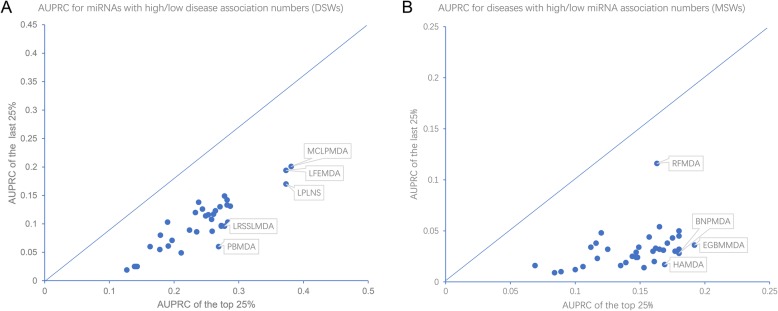
Fig. 3.
The stratified comparison of predictor performance in terms of DSW and MSW. a Dot plots where the AUPRCs of the well-annotated miRNAs (with the top 25% DSW scores) are plotted against AUPRCs of the less-annotated miRNAs (with the last 25% DSW scores). b Dot plots where the AUPRCs of the well-annotated diseases (with the top 25% MSW scores) are plotted against AUPRCs of the less-annotated diseases (with the last 25% DSW scores)

