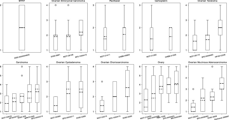
Figure 2.
Box plot of the results of the GT questionnaire. The y axis displays the possible number of ranks for each item (i.e number of answers plus the additional not-relevant rank). The x axis shows the class id for each of the possible answers for the queries. The dotted line represents the median, and the dashed line represents the mean by which the results were ordered.

