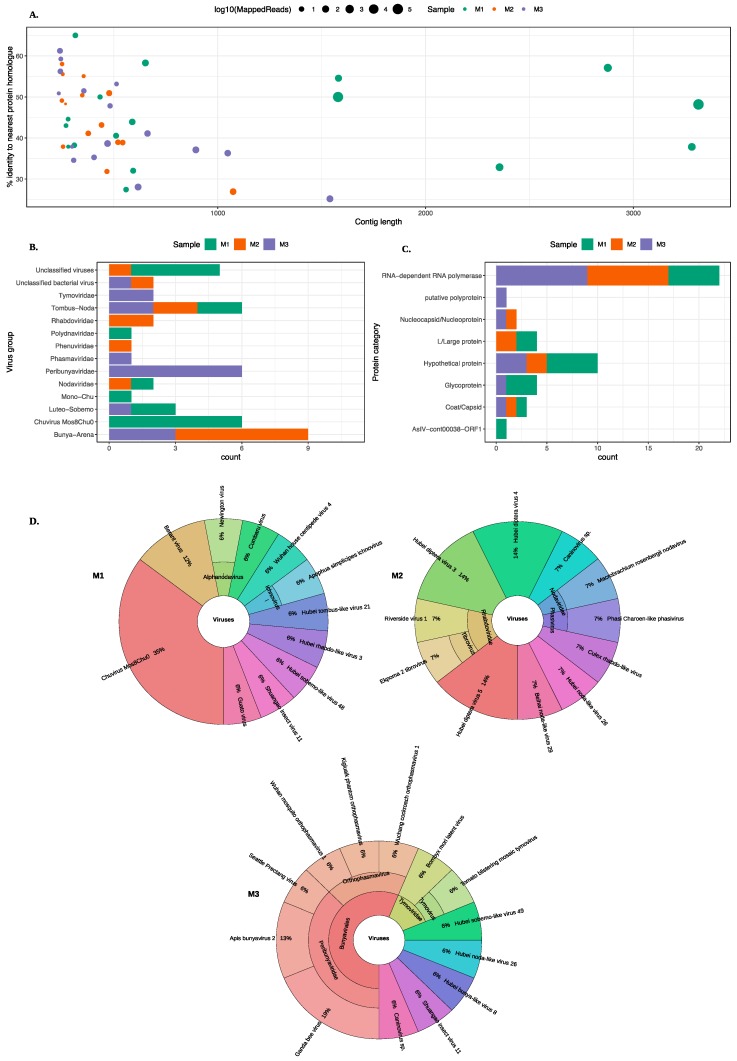
Figure 2.
An overview of the virus hits found in all midge pools. (A) A scatter plot showing contigs lengths (x-axis) and the corresponding percent identity (y-axis) for the top BLAST hit. The colour of the circle represents the midge pools and the size of the circle represent the number of mapped reads on a log10 scale. (B) A bar chart describing different virus groups found in the midge pools where each pool is represented in a different colour. (C) A bar chart showing different proteins found in the midge pools characterised based on the nearest BLAST homologue. The virus classification groups and protein categories were derived based on the closest viral sequence match. (D) Distribution of the closest viral homologs found in the midge pools. Krona plots show the nearest virus hit found in all three midge pools, M1, M2 and M3 respectively. Colours in the Krona charts represent the distinct taxonomic groups.

