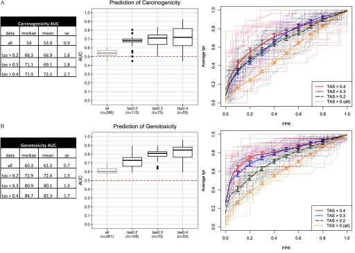
Figure 2.
Performance of classifiers in predictive models of (A) carcinogenicity, and (B) genotoxicity. From left to right: a) Summary statistics tables of area under the ROC curve (AUC) for each transcriptional activity score (TAS) subsets; data represented are the median, mean, and SE (standard error) of the AUC scores; and b) box plots of AUC across resamples () for each TAS subset with the lower, middle, and upper hinges corresponding to the 25th, 50th (median), and 75th percentiles, respectively, the upper and lower whiskers extending to the smaller and largest value at most 1.5 × IQR (interquartile range) from the hinge, and data points beyond the whiskers represented as dots. Dotted line at 0.5 represents the expected AUC of a random classifier. Labels in each TAS group (“”) represent the number of unique chemicals in the model training and validation step. c) Receiver operating characteristic (ROC) curves [false positive rate (FPR) vs. average true positive rate (TPR)]. Thick lines represent vertical averaging of ROC curves across resamples in each TAS group shown with bars denoting the standard errors. Thin, semitransparent lines represent ROC curves of individual resamples in each TAS group.

