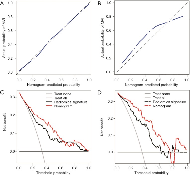
Figure 5.
The performance of the nomogram was assessed by calibration curves in the training cohort (A) and the validation cohort (B). In the calibration curves, the diagonal dashed line represents the ideal prediction, and the closer the blue dashed line is to the diagonal line, the higher the prediction accuracy of the model. The clinical utility of the nomogram was evaluated by decision curves in the training cohort (C) and the validation cohort (D). In the decision curves, the black line indicates the net benefit of assuming that there are no patients with microvascular invasion (MVI), and the grey line indicates the net benefit of assuming all patients with MVI. The red dashed line indicates the expected net benefit per patient based on the nomogram, and the black dashed line indicates the expected net benefit per patient based on the fusion radiomics signature. The farther the decision curve is from the two extreme curves, the higher the clinical decision net benefit of the model.

