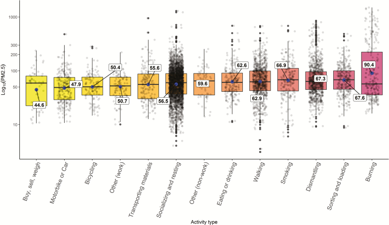
Figure 3.
Personal inhalation exposure to PM2.5 by activity type (image based) and sorted by ascending geometric mean. For each boxplot, the midline represents the median value and the labelled blue point describes the geometric mean. The upper and lower limits of the box represent the 75th and 25th percentiles, respectively. The ‘whiskers’ extend to 1.5 times the interquartile range from the top and the bottom of the box. The points beyond that distance are represented by individual points. The jittered black points show the density of data by activity; each point represents a 5-min PM2.5 average value.

