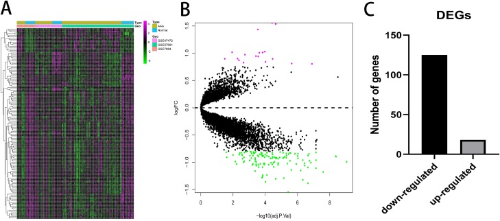
Figure 2. Differential expressed genes analysis.
(A) Heatmap of 143 DEGs. The diagram presents the result of a two-way hierarchical clustering of all the DEGs and samples. (B) X-axis represents −log(adj.P.Val) and Y-axis represents logFC. Magenta dots represent genes with logFC > 0.8 and −log(adj.P.Val) < 0.05. Green dots represent genes with logFC < −0.8 and −log(adj.P.Val) < 0.05. (C) Black bar represents the number of down-regulated genes. Grey dots represents the number of up-regulated genes.

