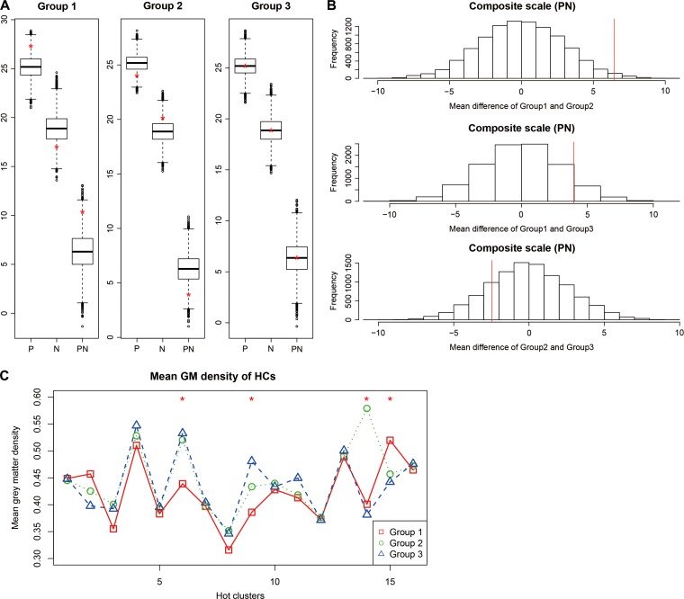
Figure 4.
Positive and negative scores in different subtyped patients. (A) Boxplots of mean positive (P), negative (N), and composite (PN) scale scores over 10000 permutations. The red ‘*’ represents the mean score of the original un-permuted groups. (B) The empirical distribution of the Group-wise difference over 10000 permutations. The mean difference of the composite scale (PN) scores between Groups 1 and 2 (MeanPN12), Groups 1 and 3 (MeanPN13), and Groups 2 and 3 (MeanPN23) over 10000 permutations are shown in histograms. The x-axis represents the difference of group mean scores of the pair of permutated groups. The quantile of the P-value is represented by red lines. The x-axis represents the difference of the mean composite scale scores of a pair of permuted groups. The quantile of P-value is represented by red lines. (C) The mean group GMV of each HCs, with Group 1 shown in red, Group 2 in green and Group 3 in blue. The red ‘*’ indicate significant differences in GMV of the corresponding HC among groups (Supplementary Table S6).

