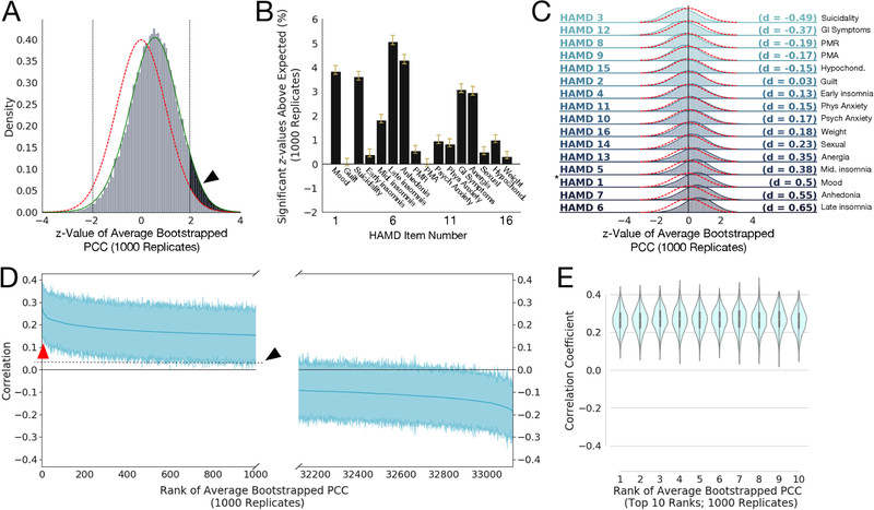
Figure 1: Robust correlations exist between Resting State Functional Connectivity Features (RSFCs) and clinical measures (HAMD).
A) Histogram of z-values for the 33,123 average Pearson Correlation Coefficients (PCCs) between RSFC features and HAMD item 1 (“depressed mood”) scores, averaged over 1000 bootstrap replicates, and compared to a standard Gaussian distribution (red line) and with a smoothed kernel density estimate plotted over the histogram (green line; see Methods). The black arrow and shaded region show the area of the z-values that exceeds the area expected for a standard normal distribution (outside the two-sided significance criterion of z > ± 1.96 for p < 0.05; shown as vertical dotted black lines). Note the empirical distribution of z-values has sample mean and standard deviation , respectively, with the lower-than-expected sample variance resulting from correlations among the statistics; we correct for the effects of such inter-statistic correlations using the procedure in (35)(see Methods). B) Bar plots of the mean percentage of z-values that exceeded that expected by chance (e.g., the percentage above 2.5%, shown as the shaded black area in A for HAMD 1) for 1000 bootstrap replicates. Yellow whiskers on the bars denote 95% confidence intervals (corrected for multiple comparisons and data correlation using Bonferroni-Holm and (35), respectively). We see that HAMD measures 1, 3, 5, 6, 7, 12, and 13 have mean significant percentages well in excess of 1% more than expected under the null hypothesis. Anhedonia also encompasses work activities; PMR = pscyhomotor retardation; PMA = psychomotor agitation; psych = psychological anxiety symptoms; phys = physiological anxiety symptoms; GI = gastrointestinal symptoms; anergia also encompassses somatic symptoms; hypochond = hypochondriasis; weight = weight loss or weight gain. C) Histograms of z-values like that shown in A for all 16 HAMD clinical measures considered, ordered by effect size (Cohen’s d, given at right of each plot; magnitudes between 0.2 and 0.5 are considered small to medium effect sizes, between 0.5 and 0.8 are considered medium to large effect sizes; calculated between the smoothed z-value distributions like the green line in Fig. 1A with the standard normal). Red dotted lines denote the standard normal distribution. Asterisk (*) marks the distribution for HAMD1 shown in A. Symptom abbreviations as in B. D) Bootstrapped PCCs for HAMD measure 1 for the 1000 most positive (left) and 1000 most negative (right) RSFC features (shaded regions shows 95% percentile-bootstrap confidence interval for the mean), ordered by mean correlation (thick blue line). Red arrow points to top 10 most positive-ranked RSFC features (shown in E); note both have confidence intervals excluding zero, indicating that while they cover an appreciable range, they are significantly different than zero across the 1000 bootstrap replicates and thus somewhat stable across bootstrap replicates. The black arrow and dotted line show the upward shift resulting from the positive shift of the distribution shown by the black arrow in panel A. E) Violin plot (with superimposed boxplots showing 1st and 3rd quartiles as black bar and the median as white point) of the top ten positive ranked RSFCs by average PCC to HAMD measure 1 (corresponding to red arrow in D), with mean 95% confidence intervals ± SD of [0.148 ± 0.0152, 0.376 ± 0.0119]. Note these look very similar, suggesting the rank order could easily change across replicates.

